CASE STUDY 4 OF 8
SPATIAL TYPOGRAPHY LAB
I built a spatial typography lab to stop guessing.
Flat interface rules were not enough for text that lives at a variable distance in a real room. I needed repeatable studies that could become product decisions.
Context
visionOS · SwiftUI prototypes
My role
I owned the study design, variables, prototype direction, comparison criteria, and transfer into Clear Page and Clear Writer.
- Studies
- 8 hardware studies
- Rooms
- 12 lighting conditions
- Variables
- Distance · Depth · Scale · Contrast · Material
- Transfer
- Rules applied to two products
- Role:
- Researcher, designer, and prototype director
- Privacy:
- No participant data · No network services
01
A screenshot hid the real variables.
The same type size can feel intimate, distant, or unreadable depending on window distance, material, lighting, and the depth of nearby controls.
Instead of polishing isolated screens, I separated the variables and made each study answer one question.
02
Five variables became a test matrix.
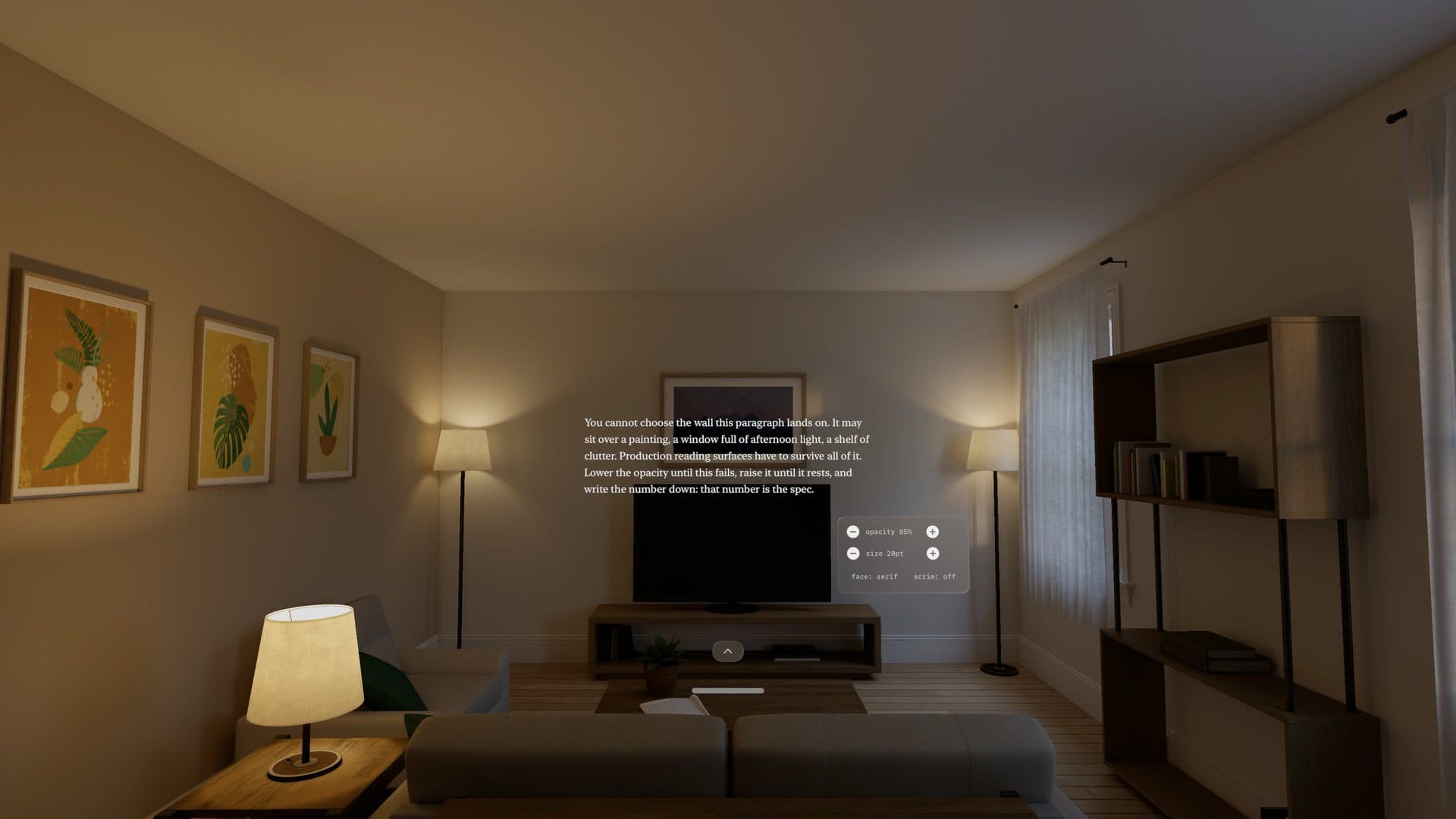
The studies compared optical size at distance, line length, foreground lift, panel contrast, and text behavior against changing rooms.
Each prototype kept the reading passage constant. That made differences in comfort and hierarchy easier to attribute to the interface rather than the content.
03
Depth needed thresholds, not decoration.
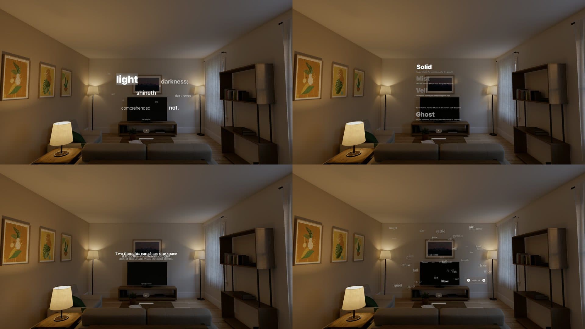
Small z-offsets looked meaningful in code and disappeared on the headset. Larger separations became useful only when paired with material and contrast changes.
That finding produced a practical hierarchy: page text at the base reading plane, controls above it, and temporary surfaces far enough forward to remain distinct.
04
The lab became product infrastructure.
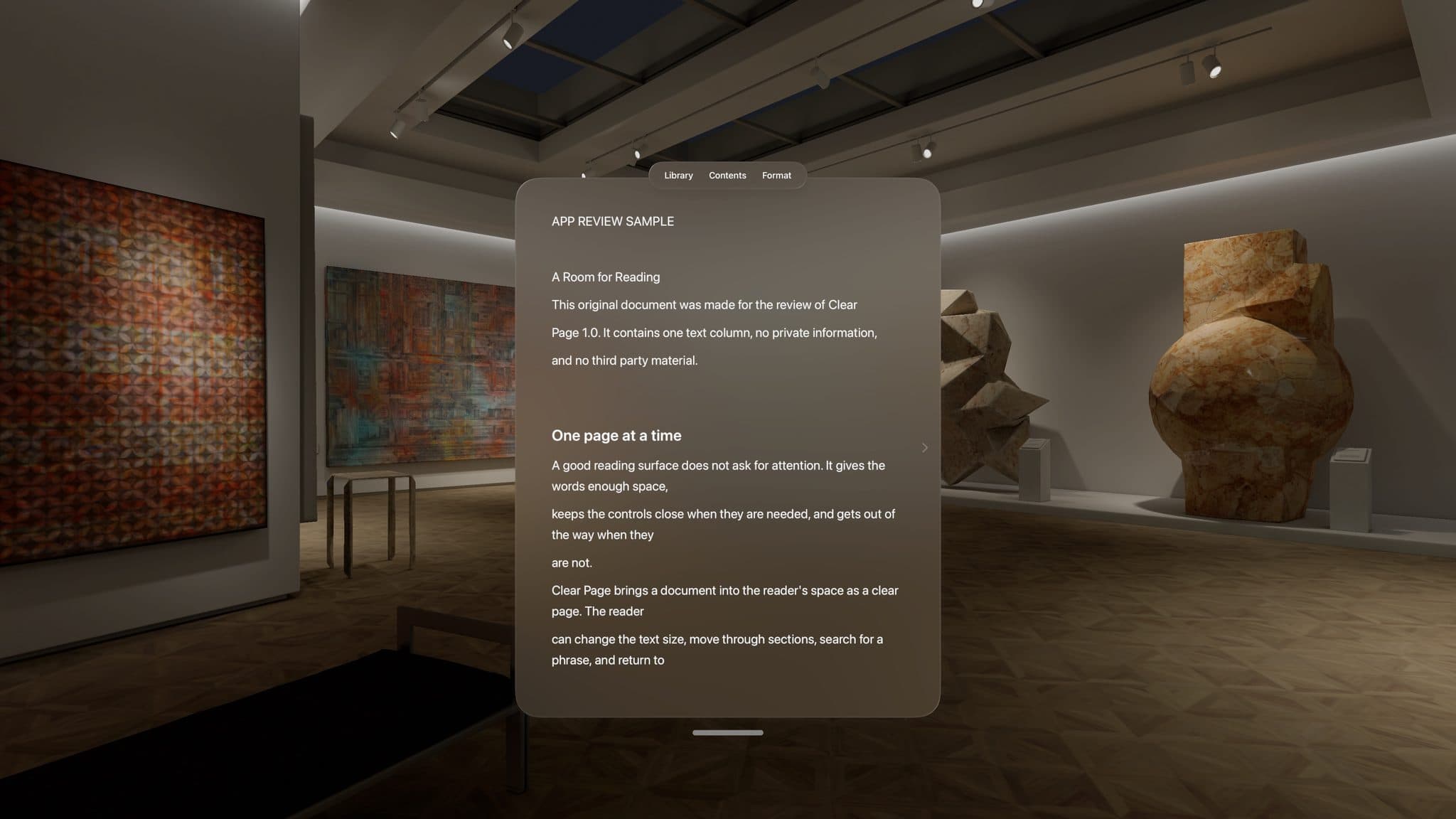
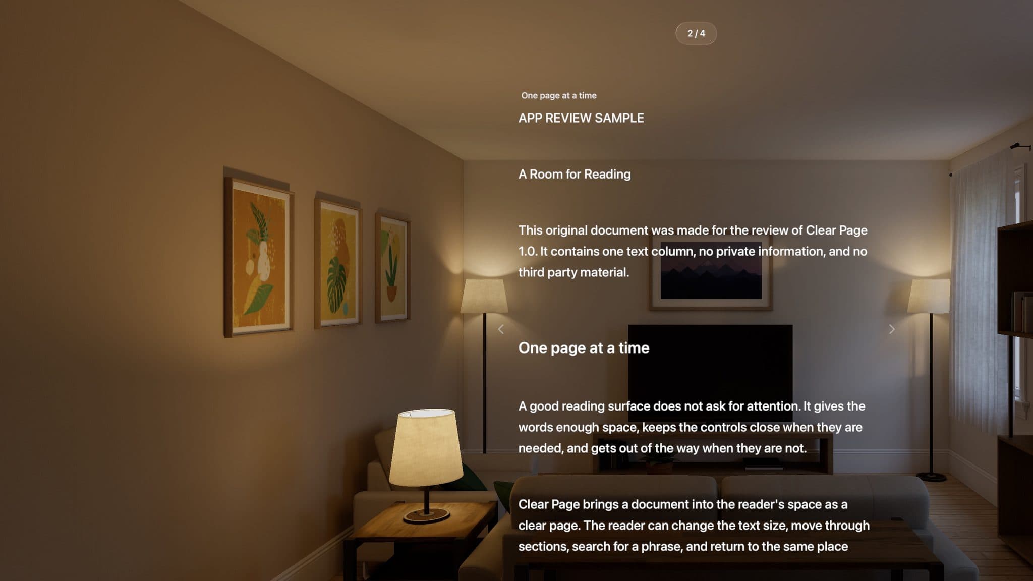
Clear Page used the lab’s line-length, scale, material, and depth rules. Clear Writer reused the same hierarchy, then changed behavior where writing demanded it.
The result is a shared set of rules for type, material, and depth, with room for each product’s behavior.
AI working method
How I used AI to move from product decision to working software
- Product decision
- Study design, variables, prototype direction, comparison criteria, documentation, and transfer into Clear Page and Clear Writer.
- AI-assisted build
- I used Claude Code to build controlled SwiftUI variants from my test matrix, then compared them across twelve room conditions and set the product rules.
- Evidence
- Studies: 8 hardware studies
- Rooms: 12 lighting conditions
- Variables: Distance · Depth · Scale · Contrast · Material
Current boundary
What this work does not claim
The research records controlled prototypes and room comparisons. Some comfort conclusions still require longer physical-headset sessions with more readers, so they are working rules, not universal standards.
REFLECTION
Reusable components were not enough.
A useful spatial design system began with repeatable judgments about distance, contrast, and depth.